Sunday 19 October 2014

Composition rules


Composition

Definition: 
com·po·si·tion


1.a. The combining of distinct parts or elements to form a whole.
b. The manner in which such parts are combined or related.
c. General makeup: the changing composition of the electorate.
d. The result or product of composing; a mixture or compound.
2. Arrangement of artistic parts so as to form a unified whole.
3.
a. The art or act of composing a musical or literary work.
b. A work of music, literature, or art, or its structure or organization.

  • Balance: Symmetrical arrangement adds a sense of calm whereas asymmetrical creates a sense of unease imbalance.
  • Movement: There's lots of ways to give a sense of movement in a composition such as the arrangement of objects, position of figures and maybe the flow of the sea.
  • Rhythm: A piece of art can have a rhythm in the same way music does. People do this by using large shapes and repeated color.
  • Focus: Artists add focal points within there paintings to pull the viewer in instead of leaving there eyes to wonder around in space.
  • Contrast: The differences between light and dark, or minimal. (Whistler- Nocturne series)
  • Pattern: An underlying structure, basic lines and shapes within the composition.
  • Proportion: How things fit together, big, small, nearby and distant.


The Golden ratio: 


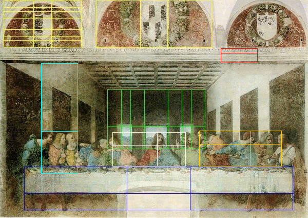
First when reading about the Golden ratio I got really confused on how to work it out. I found a site which explains it relatively well and got me to understand on how to draw the golden ratio. The way I like to work the golden ratio out is by drawing it out, I really dislike using formulas so this image was perfect for me. I think I could use this rule in my compositions as I do like using measurements in my work and do like mathematics when it suits me. Da Vinci used the golden ratio within his work such as 'The last supper'. This piece of work has the golden ratio placed allover. Michelangelo and Van Gogh also used the Golden ratio within their art. Also buildings have the golden ratio within them such as the Parthenon in Greece. Whether or not this was deliberately done we don't know.


The rule of thirds 


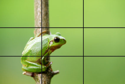
The rule of thirds is applied by aligning a subject with the guide lines and their intersection points, placing the horizon on the top or bottom line, or allowing linear features in the the image flow from section to section. At first I was really unsure of what the rule of thirds was but once I read up on it I found it simple to understand. The rule of thirds is defiantly a rule I would use in the future. What I like about this rule is that there can be a lot of negative space but the rule bring the audiences eye to the focal point. I looked through my own photographs I have taken noticed that the rule of thirds can be found within them.


Without mathematics there is no art,”  said Luca Pacioli, a contemporary of Da Vinci.


Resources:
http://painting.about.com/od/artglossaryc/g/defcomposition.htm
http://www.digital-photo-secrets.com/tip/3372/18-composition-rules-for-photos-that-shine/
http://www.atdesignonline.com/education/Common/Composti.pdf
http://www.mathsisfun.com/numbers/golden-ratio.html

Saturday 18 October 2014

Game Industry

I have decided to design my poster around the game industry development. I thought I use old games such as Mario, Tetris, Pacman Atari breakout and Space invaders to show how far the gaming industry has developed already. Also using these games are a bonus as they are well known games and are eye catching.

I want to keep my design clean and clear. 


Thursday 16 October 2014

Poster Development


Poster Development


Here are my first designs I came up with when we started our posters. This first image was the first poster I had designed for this brief. For this I started off playing around with the background. I merged the Background layer to a replacement photo I had got of the internet of the British flag. I experimented with different background colors to see which worked the best with the flag. I ended up choosing a black background to merge together. I mixed them together slightly so it was still a clear image of the flag and didn't make it look overdone. I love the tool to merge the two together. It's defiantly one of my favorites. Once I had finished with the background we got taught how to to duo tone on photos. I grabbed a photo of the internet and began trying the tool out. I mixed a bright blue with black to go with the flag. Using a brighter blue was a better option to me as it stood out from the background and didn't interfere. Also duo tone is another tool I am interested in and hope to play around with it some more to see what else I could come up with. After playing around with the background and imagery I started playing about with fonts. Ariel an Helvetica are two of my favorite fonts as they are simple and easy to read. I prefer not to over do on fonts as yet again I didn't want it to interfere with the design. Once I had done all of this I wasn't to keen of this poster and began moving onto other ideas.

This second design was initially about the business side of the creative industry I was going to place facts on how much money the industry is worth and how many fields of jobs there our within the industry in the UK, hence the British flag. I actually really like this design and thought that it would become one of my final designs once I had replaced the photos with my own imagery and not of the internet. Reasons being, copyright, quality and it's not my own design. After looking into the business side of things I thought I might try out a different approach to the facts with using Graphs and arrows to show the rise of the industry. Overall when I had sketched and played about with the whole idea I didn't think it was a fun approach to the audience.

After doing some poster designs I started reading through the articles I had got about the creative industry. My eyes got caught on the games side of the industry. I thought I could base my work around the 'work ready' pledge so that people who are interested in games design and are wanting to get in the industry could have courses which would help them be work ready. Also I wanted to base it around how far the industry has developed and how much there is out there to do with gaming design. I kind of started exploding with ideas. My first initial idea was to include Mario 8-bit.


Here are my Mario inspired designs I had created using Illustrator and Photoshop also with print screens whilst I was exploring my options. To start of with I created a background on illustrator simply using the square/rectangle tool. I colored the blocks in using the colors which are used in Mario 8-bit. Once I had finished the background I converted it over to Photoshop which then I started to use the pixelating tool to make the background more old school style.

In the end I wasn't really happy with this design. I just didn't feel satisfied with the pixalations and whole plainness of it. Then I had decided I could try another old school came and I thought about using Tetris.


To start of with I searched for images on the internet off the Tetris blocks. Luckily enough I had found an image which had no background and just the blocks, this made it easier for me to use the magic wand tool and select the blocks. I added a black background to my first layer the same as the real game would be. Then I started copying and pasting my selected blocks onto my poster layout and playing around with them seeing how I could position them to look like the game is being played. I took a few screenshots of the process. So far I really liked the idea of my game design poster. The bright colors on the black background made it stand out.  Once I had played around with the layout of the blocks I then proceeded to trying out typography for the poster. I wanted a simple font so it was easy and clear to read. With the blocks being 3D I was having trouble with the font. The title didn't stand out. I knew this was only used with replacement pictures but I liked the look of the 3D Blocks.

Because I wasn't happy with the blocks I started trying out using 2D blocks. I thought I would made a grid like some of the Tetris style games use. Then I simply colored in the squares using the shapes Tetris features using the common colors. I didn't really like the look of this design and thought it wasn't good.


When I was at home thinking about my designs I did some personal research and asked my dad and brother about what old school games I could include in my design ideas. They bombarded me with games and then they continued to talk to one an other about the games. One of the games they gave me was Atari Breakout. I started to look at pictures of the game and actually had a game of it on Google images. This game was actually a good game to use in my deign as it's simple and wouldn't over run the typography on my poster. When I went to college to following week I began playing around with tools to produce the layout of Breakout. I simply used the rectangle tool to come up with the blocks/lines and colored them to be the colors of the rainbow. Also I created to ball and bat with the shape tools. I included the breaks within the target to make it more obvious to what the design was. Breakout turned out to be my favorite idea and decided to use it for my final poster. I really liked the simplicity of the design.


Final Poster


Thursday 9 October 2014

Group composition


Me and my college friends had been told to create a composition from the paintings we had created the week before. First of all we chose out our favorite and most interesting parts of our paintings which we thought would look well in the composition. When we had decided on a layout for the composition which took a while we cut out the parts we would use within our painting. Then we began pinning our pictures on the wall in the layout we had sketched out. When we looked at it on the wall in the layout we had chosen we began thinking on how we could use our pictures to make the audience engage with our painting. We then started juggling the pictures around to see how where the focal point would go and worked around our color scheme so our composition wouldn't make the audience stare into space as we wanted to pull the audience in. This took us a fair amount of time to final come to an agreement.

After we spent our time deciding on a final composition layout we started by priming the canvas with a light blue paint which was liquefied with water. Once the base was near of enough dried we started on the background of the swirls. We all participated in this. Everyone kind of did there own thing using whatever colors they wanted and ended up swerving from the color scheme. In the end of the swirls I noticed Eleanor's brightly colored ones. I love how bright her swirls came out as she used inks and paint an thought it was a great part of the work we had done so far.

So far all the had was some pretty swirls and it felt as if we was going to end up with a composition with no 'oomph' in. We then moved onto the key element to our composition which was the jagged black lines with the orange in the middle. We all started to begin applying the two black jagged lines into the middle of the canvas. Whilst doing this we had some disagreements and agreements whether to blend the lines out or to keep the sharp. Preferably I wanted them blended as I could see the composition turning into a landscape. We ended up with a mix. Whilst working on the black lines Emma started adding blue ink to black and blending it in and leaving some to bleed. I loved the blue with the black it made the canvas pop out more and grabbed my attention to it.

Once the black was finished with the started on the middle part of the lines. We began by splatter and smudging yellow and red paint. Once we had finished covering the middle we attached the canvas to the wall and stood back to evaluate our work. We found some points of the composition we didn't think stood out and what could be added and improved. In the end we added more color into the middle of our composition to brighten it up. Also we added some trees and a moon at the top of the painting to turn it into something more recognizable.

Overall I really enjoyed this task. It taught me how to compromise well with other students and gave me more confidence to share my opinions. There is a few things I would change about this painting, such as the trees at the top as I would of liked them to of been more blended in with the black. Despite to fact of this I think the painting we have created is a strong piece of work and enjoyed my time doing it.


Artists and the relations:

Whilst we was in the middle of our composition our painting reminded Jon of John Martins work. John Martin became publicly acclaimed in 1816 with his piece 'Joshua Commanding the Sun to Stand Still upon Gibeon' even though this piece broke many rules of composition. Even though he fired up the Pre-Raphaelites especially Rossetti a Pre-Raphaelites poet John Martin had also gained a few followers and fans such as Thomas Cole, Rider Haggard, Jules Verne and even the French Romantic movement were influenced by him. 

I do enjoy some of John Martins work such as The Destruction of Sodom and Gomorrah 1852 and The Destruction of Pompei and Herculaneum 1822